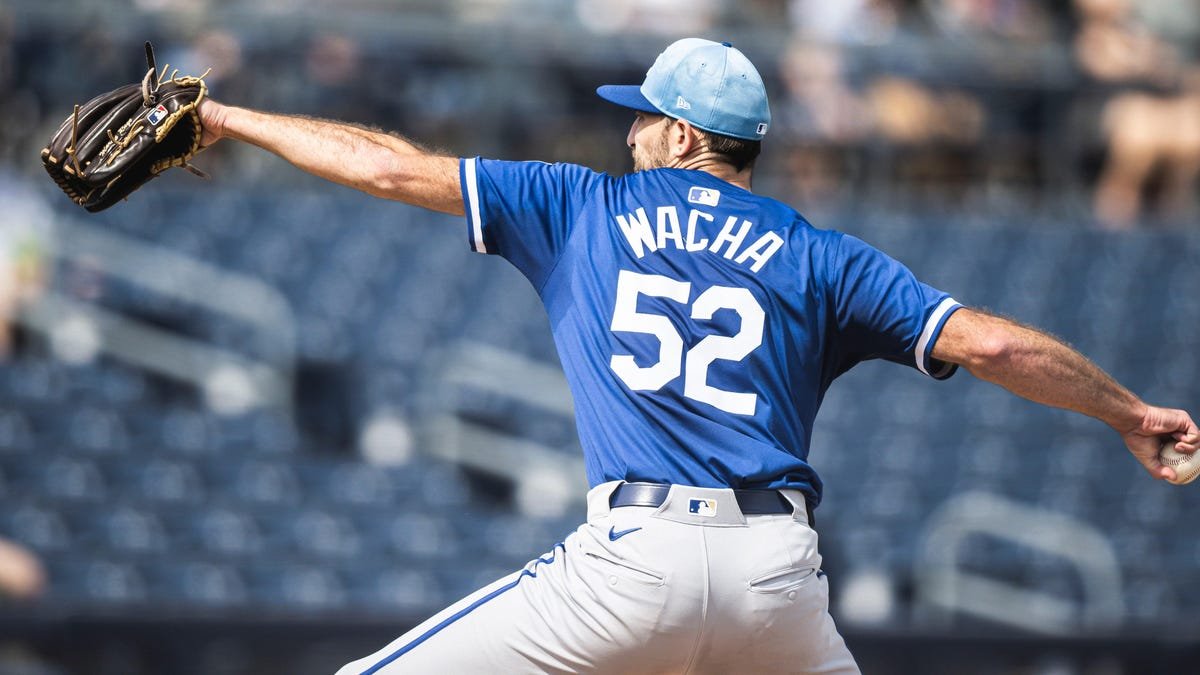
The Kansas City Royals are taking a stand against the trend of smaller, press-on letters on jerseys that has been sweeping through Major League Baseball. In a move that has garnered praise from fans and critics alike, the Royals have requested that full-size letters be put back on their jerseys, according to Uni Watch.
This decision sets the Royals apart from other teams who have accepted the change to the smaller, less visually appealing letters. The St. Louis Cardinals have also made a similar request to keep the chain stitching on the logos on the front of their jerseys. It seems that only a few teams are pushing back against the change, despite the fact that many fans and players are unhappy with the new look.
The move by the Royals and Cardinals highlights the importance of tradition and aesthetics in sports. Fans want to wear jerseys that look like the ones they see on the field, and players want to feel proud of the uniform they wear. By standing up for the classic, larger letters on their jerseys, the Royals and Cardinals are showing that they value the history and tradition of the game.
In a time when many teams are focused on marketing and merchandise sales, it’s refreshing to see a team prioritize the look and feel of their uniforms. The decision by the Royals to go against the grain and request full-size letters on their jerseys is a bold and commendable move that has been met with widespread approval.
As fans eagerly await the start of the baseball season, they can look forward to seeing the Royals take the field in their classic, full-size lettered jerseys. It’s a small detail, but one that makes a big difference in the overall aesthetic and appeal of the game. Kudos to the Royals for standing up for what they believe in and keeping the tradition alive in the world of sports.


